These are so pretty. I'm pretty sure they have been 'net printed', unless they were printed onto a clear sticker and then stuck onto the glass bottle. The delicate text and design overall, just makes the milk look so much cleaner and more fresh. Minimal colours used as well adds to the effect.
A lovely example of a simple logo being used. This packaging is so simple, just a sleeve around the cup and yet as a range they all work so well. The patterns on the cups as well is a nice touch, I reckon they could be used to show the variety. A different pattern for a different flavour.
Really like this style packaging for drinks, I think cardboard/durable card is such an authentic way to package liquids. Especially milk/juices/smoothies as it enhances their organic ness. I also like the colours and the rough effect they have because of the stock they have been printed onto.
When grouped together, these wine bottles look good. I can't imagine how the wine would taste though, I feel the design doesn't really compliment the drink itself. It kind of suggests dairy? Or more diluted, maybe a mixer&sprit if it had to be alcoholic, or a squash drink? But as a design I like them, they are unique, and I like the use of only two colours.
Not quite sure what the charcoal is for next to a cup? Although, I like the idea. Environmentally NOT friendly however, individual packaging for a single tea bag would be a huge waste of resources. Putting that aside, it's a clever/unique idea.
I saw this as a way to see the different ways to package a product. Even a single cookie can be packaged with the design&logo. Plus, I like print on brown paper.
Example of embossing&spot varnish, but mainly, mugshots on a product. Just something I can work from, or influenced a tiny bit. The image as a whole overall I'm not so keen on, but, the idea is there.
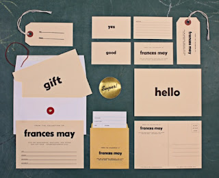
Variety of products to print onto, methods of distribution. The design of the pieces isn't anything special, I feel is works and is alright, but it's the range that I found interested. Tags/postcards/cards/stickers, loads.
I have really become a fan of the use of only one colour. It connotes the product in a fresh/clean way. The simplicity, the way the colours follow through the label to the cap and the bottle shape, is what I like.
Again, white with little colour, seems to be quite popular at the moment. I like to see packaging of products like milk/juice as being little pieces of art. I like the type appearing as grass, also how its nice and faded, not too harsh.
Works amazingly with a glass so you can see the bird. So pretty. I just liked this.
I'm not actually sure what these are, but I really like the packaging for them. The white box with a simple two lined set out is perfect for the multi coloured objects inside. It balances out the whole product, having a pale/calm colour works well with intense colours to balance it out as a delicate product.


No comments:
Post a Comment