
|
Friday, October 23

James Carver Grenside
Pretty good photographs, dealing a lot with lighting, atmosphere and overall context.

|


Thursday, October 22
Ben Tour


I looked at the work of Ben Tour when I was experimenting/using watercolours. I really like how the vague/washed out look can still have all the detail of a face, I can still see a strong expression. The hardness of the medium also varies, some of his paint/ink is applied very weakly where as the darker, more precise layers compliment his work. I also really like the little letters he has added and the use of colour.
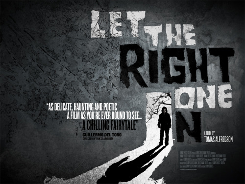
Craig Ward- typographer
http://www.wordsarepictures.co.uk/


I love art that captures emotion, Craig Ward has done this effectively through the use of letters, using them in a variety of shapes and shades.


Really like the colours and the type he has used, emphasises the city essence.

I really like how Craig Ward's work is really clever, it is so cleverly put together and looks creatively sophisticated.


I love art that captures emotion, Craig Ward has done this effectively through the use of letters, using them in a variety of shapes and shades.


Really like the colours and the type he has used, emphasises the city essence.


Tuesday, October 20


Monday, October 19


Subscribe to:
Posts (Atom)