Friday, November 20

working the metaphor


This was one of the opening titles for the FilmFest-Typophile. It seems to be a quick summary of Life,
going through the stages of growing up, moving out,
getting married etc... What makes it so clever is the way in which
such a broad thing as Life has been compressed into a series of moving images and type.


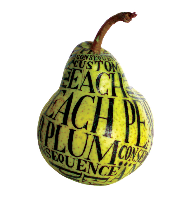
This form of typography by Sarah King is the use of type on image to communicate the type. I like how the form of the pear is demonstrated through the curves and size of the type itself, if the type wasn't there, I think the pear would look a lot more flat. I consider this as a creative way of writing, instead of just on paper, writing about fruit on fruit seems to simple yet it is so effective.


This is also by Sarah King, she seems to use the same effect where the shape and perspective of the type represents things that are going on in her image. The way the words are coming out of the face seem to act as speech, it's as if the words are flowing out. With this poster she is informing about the available courses that will be explore throughout the 'Degree Show'. The font she has used is very suited, it is eye catching and immediately suggests the creativity of the show's contents. The way the type seems to flow together and also compresses each other could be exploring the detail and amount that the 'University of Brighton' has to offer.


What attracted me most to this was the type used, it's style (iranian) almost appears more as image because of it's swirls and the fact, to me, they are just a series of little images because I don't read it as words. The boldness and structure of the image contrasts with the type but in a way that seems to balance out the image as a whole. The design communicates power and control but is also softened with the warm colours that surround the dark figure, and the way they are placed.

Thursday, November 19

Working the metaphor


It's not certain whether this is purely image or whether it is a form of type. I would say it is type as image, it seems to communicate depth, a bit like how 'love' is deep, a feeling that is not necessarily open but quite enclosed and secretive. The way they are clumped together also represents a pile of rose petals? This relates back to love and compliments the image/type helping the audience understand the visual type and the meaning of it. The black and red could be seen as quite sinister but I think the softness of the petal-like font seems to eliminate the dark aspects of it, changing those interpretations to 'deep'.


The layout of the type is constructive as it forms itself with the world map. It's meaning/purpose simple, to express the map of the world but in a creative way including type. Analysing it further the way the type appears too big could help represent the large scale of the world? The busyness is shown through the cramped style of the text and also the type itself, very bold and thick.


This effectively communicates the unexplainable feeling of love. The use of fridge magnets suggests complication, getting random words and trying to piece them together to create a sentence that makes sense. This probably shows how 'loving you' feels like, a mass of words that even when formed as a sentence theoretically, still don't make sense. This is easy to read because of the structured, simple type used, there is no image created or meaning behind the type itself, the complexity of it comes after reading what has been stuck. Communicating something isn't always how you do it, but what you write.

Working the metaphor

Graphic Design through history...

This by itself would appear as an oil painting, representing a piece of artwork considered probably as 'fine art'. As graphic design started to develop, including type into an image meant that the image suddenly had another purpose. The text would communicate the image, without it, it wasn't a piece of graphic design.


I quite like the illustration look this piece of graphic design has. It was produced in 1893, the type is starting to incorporate itself more with the image, the piece starts to work as a whole, not just as two separate layers, type and image.


I really like the structure of this, the importance of the people in it seems to be communicated through the positioning of type and image, and the type itself. It seems to appear very authoritative and it being almost centered suggests boldness.


I really like both of these posters that advertise the volkswagen range. The one of the moped communicates by itself the size of it because of how small it looks on the page. This is also explained further with really simple, straight forward type "Think small". I think the simplicity of these posters is what makes them so effectively, it seems to modernise the poster and the motors themselves.


Tuesday, November 17

Working the metaphor

3. Producing images that effectively communicate a message to an audience

This image effectively communicates that this bottle of cider is enriched with a strong, juicy apple taste. It makes the drink look far more appealing, and also gives it an organic/authentic look to it. No type is needed to explain the point of this image, it is positively advertising without having to explain the great taste of the cider. I would say this is a visual metonym, it is a symbolic image that is used to make reference to something with a more literal meaning.


I don't think this is that good, but I like how the dot above the 'i' has dripped through it and is falling down into a pool of liquid. I feel this could be designed in a much better way, but I was drawn to the idea more than the overall design. It is a clear, simple example of using type as an image to help communicate a point. The letterform 'i' slightly represents something wet which relates to the word 'drip', the two work well together.


I really like this, it includes black and white photography, and very little text. The text is also quite poetic which I admire a lot when it comes to design. I feel it is all part of the creativity of a piece of design. The space in which the text has been placed is very effective, its as if it has fallen just where the bubbles start to fall. Your eyes are drawn there.


I love the work that includes photography and type, I just think the type is so simple yet what is being said is so complex. When faced with this image it could seem as such an open thing, with opportunity, however when the text is added "i dont know what to do", it suddenly becomes such a confusing place. Although, somehow the place still seems relaxing.

Images that communicate


Purely image, this black and white photograph focuses primarily on the expressions of people. A type of portrait photography although the full frame suggests a crowd/busyness. Some of the facial expressions are high in impact because they are all so different and don't seem to be set up/staged.

Good advertising

Friday, November 6

Working the metaphor


Visual synecdoche - Yellow cabs, their imagery represents a specific thing (New York City)


Visual metonym - a symbolic image that represents a person/place/company etc.. (Statue of Liberty-NYC)


Visual Metaphor - A direct link is thought of with a particular image, however the image has other visual interpretations (The Big Apple)


1. The ability to construct meaning from visual images and type:
Craig Ward effectively uses type and imagery to communicate what he the type means. The word 'blow' is expressed through the exploding imagery.
David Carson communicates 'blah', mess and be-willderness with scattered type and a blunt expression on the mans face.

Sara Fanelli, I feel the meaning of this is to explore someones creative imagination. The colours, layout and scrap book effect all help communicate this.
Found in newspaper, simple but strong text with an effective, emotional image that easily communicates the advertisements meaning.


2. Interpreting images or the present, past and a range of cultures:

Photograph taken by Andre Kertesz, this was taken in the early 1900's and Kertesz obviously found it an interesting image to capture.
Its aim is to communicate the affects of alcohol, certainly a more modern topic to communicate, but there is very little type in this, the image it self effectively communicates this.
Although this could be under the catagory of constructing meaning from a visual image and type, I feel it is a very effective piece of war propaganda. It obviously originated from a culture other than Japanese, the type is communicating a sort of patronising yet evil approach towards the Japanese wanting US/British troops to 'take day off'.
Film poster for Saw 5, 2008. Minimum type required to communicate such a disturbing image. The technology of today means that such reality can be expressed with not that much explanation needed.
This was produced in 1933, it is a lot more animated/illustrated, but still manages to communicate a sense of power/aggressiveness.