
Thursday, May 20

Wednesday, May 19
Thursday, May 13
debut art, tags- printmaking, advertising, abstract


Layouts, I like how the middle one doesn't seem to have any limits, the fold itself works with the image&type, I also like the yellow circle and the circles in the bottom one. Slight influence when it comes to the layout I have to do exploring Indesign and my partners interview.


These two are a bit too pop arty, but I like the simplicity of them, although the ketchup one is quite busy, the idea of just repeating one red bottle of ketchup works well. I think this would look good as a label for a ketchup bottle or something.
Wednesday, May 12
debut art, tags- printmaking, silhouettes, animals

I really like print work, it always just seems to much better than digital print because it isn't always perfect (maybe alignment, colour bit off). This is quite experimental, I think all these pieces are, I just liked looking at them.


Great use of layout here, everything is so tiny and fragile, the thin column and small black printed birds seem to compliment each other and the message I suppose they are communicating. Small and dainty, block coloured, monotone- effective.

Good concept, really like the idea, with a purpose and a bit of type I think this could go quite far. Entertaining.

Works so well, just as a poster, just a piece of nice print, colour choice is soft and peaceful like butterflies.


Book cover- I like how the donkey is spread across both pages, that DPS would work flat out and folded hugging a book. Great use of imagery and type.


debut art, tags- constructivist, advertising, russian, pastiche


debut art, tags- contemporary, advertising, type design


Same artist as the top image, (Yehrin Tong), even under the tag contemporary these designs still seem to hold onto a traditional look, they seem so imaginative which could help portray the fictional aspect of 'books'?


I just think these are amazing pieces of art/design really, I am impressed with the detail if anything, without going into too much depth and critical analysis, simply I just like them. As posters I admire the layout of the bottom one, despite the small gap being so simple I think it does a lot for it's overall appearance. Both of these can be quite straining for the eyes, lots of overlapping, stripes, curls etc... but I like that, I'm not always a fan of this style but these seem creative&cultural. The zebras are included in a sophisticated way.


Favourite piece.
I think this would look best large scale, attention to detail is so good, the larger font 'first press beer at its purest' and the bottle of beer outlined through the image around it balances out the extremely detailed dragon wrapping itself around a pure black bottle. Keeps the beer a mystery and definitely approaches the drink in a stylish way, I want to drink this, it seems exotic, tasty, unusual, well that is what I get from this poster.
I think this would look best large scale, attention to detail is so good, the larger font 'first press beer at its purest' and the bottle of beer outlined through the image around it balances out the extremely detailed dragon wrapping itself around a pure black bottle. Keeps the beer a mystery and definitely approaches the drink in a stylish way, I want to drink this, it seems exotic, tasty, unusual, well that is what I get from this poster.
Tuesday, May 11
speaking from experience, colours
 I'm not sure what type of colours I am picking, but they all seem to relate, they all seem quite musky? Not really really bright. Out of this colour palette, I select ones I think have a lower saturation.
Monday, May 10

layout
 The photo is really nice, surprisingly works well when it is transformed into part of the book cover. I like the layout of this book, but not so keen on the colours.
speaking from experience, context (debut art)
'BASIC PRINT&POSTERS', found me these:
 I like how it looks a bit old and scruffy, it looks as if it would promote a rough, vintage little bar thing. The vertical rainbow down the side and the simple type is simple and effective.
 I like this for the poster overall, as just a piece of art really. In terms of communication it doesn't say much, but I like the colours and the way the image appears on the page.
 I just think this is clever use of type.
 Really nice colours here, they aren't too bold even though the colours themselves could be quite harsh. They seem nice and washed out, as does the message I think coming from it.
 These came under the tags 'vintage' & 'poster' on Debut Art. I really like the layout of them, with the small type at the top with the main image just simply laid out. Everything seems blocked and set out clearly, but the simplicity and odd colours keeps them looking authentic and attractive. The use of these three colours is lovely.
 ADVERTISEMENTS
I really like these adverts for Film4, the split screen looks professional and draws the viewers
attention to all over the screen. Even though the footage itself is not very fast, the
cinematography and division of it all expresses it in a very interesting and creative.
The simplicity of the screen shots/interviewing is just entertaining, obviously the main attraction
is who is actually being interviewed. With such big, Hollywood names a plain white background
behind a 'grayscale' face actually works very well. It forces the viewers to focus on what should
focused on, what is being said.
speaking from experience, context!
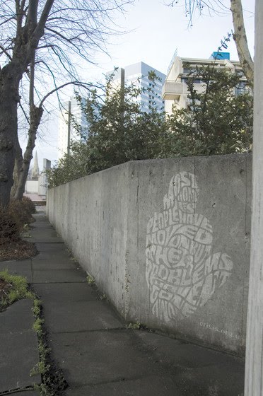
 Thought about my project when I saw this, could it be want and need? As in shopping trolleys, relating to the food 'want and needs'. popcorn & grapes?
 This designer primarily focuses on typography, shaping the type to fit in with the specific object. I think the banana one became the strongest interest for this project. Not sure whether this style has been done quite a lot before, it isn't my favourite.
 Method of delivery? relevant or not?

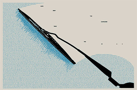
 SIMPLE AND EFFECTIVE. The design I am thinking of taking forward contains two words, 'want' and 'need', in large font and legible type, alongside two images to represent the point. This deals with large font and nothing else yet even though there isn't much to look at in terms of context on the piece of work, it still puts the point across.

Friday, May 7
speaking from experience, context!
I think I need to find more inspiration for the design of my posters and style following through the range of products for this brief. The original idea I had stemmed from the posters I found at first, 'want and need', I may have made the mistake of withdrawing too much of their style into my own. I need a new style and a new font, through many different graphic design pieces, how can I take this further?
 I like the use of the type in this, clever use of very small type that actually comes across as something.
 Simple when it comes to the colours, I want my design to be vibrant and attractive but keep the colour palette quite limited.
 layout- This almost looks like a piece of graphic design
 Doesn't relate to much to my project, but in terms of design context, I like this.
 Same designer as the previous poster, I like the bands, lines, circles, overall order and directness?
 POSTER INSPIRATION
Simple drawings with just block colour, this relates to the style I use for the drawings for my designs.
http://www.toothpaste-frosting.com/#384729/In-A-Perfect-World
On this website, there is also a selection of designs that relate a lot to the 'want' and 'need' ones I originally found. They are under the caption, 'In a Perfect World'. I think it's the simplicity of them and the topic of perfection as appose to reality relates a little bit to how sometimes you don't always get what you want.
Subscribe to:
Posts (Atom)