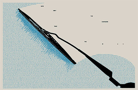
 I like the use of the type in this, clever use of very small type that actually comes across as something.
 Simple when it comes to the colours, I want my design to be vibrant and attractive but keep the colour palette quite limited.
 layout- This almost looks like a piece of graphic design
 Doesn't relate to much to my project, but in terms of design context, I like this.
 Same designer as the previous poster, I like the bands, lines, circles, overall order and directness?
 POSTER INSPIRATION
Simple drawings with just block colour, this relates to the style I use for the drawings for my designs.
http://www.toothpaste-frosting.com/#384729/In-A-Perfect-World
On this website, there is also a selection of designs that relate a lot to the 'want' and 'need' ones I originally found. They are under the caption, 'In a Perfect World'. I think it's the simplicity of them and the topic of perfection as appose to reality relates a little bit to how sometimes you don't always get what you want.
No comments:
Post a Comment