Showing posts with label BRIEF 1 - MAGAZINE COVERS. Show all posts

Thursday, November 3

Inspiration for...


Like these colours & simplicity, work as a series

Like this as a simple way to package a collection of sheets/flat pieces?

I like how information is randomly scattered, but there is also a systematic layout going on too. Makes it interesting to look at, and balances out the information. You are also easily drawn to what is more important? (top left)

(heinz brief context) I am looking at how multiple images can be placed equally and clearly. I am also looking at block colour, vector, clean cut imagery. I also like the use of the block coloured background.

scattered but controlled

Lovlely illustrations by David Pearson. I especially like the feathers, beautiful illustration and use of white space.


Sea level rising,

 I am looking for inspiration on how I can approach my g2 cover illustrations. Relating to the 'sea levels' topic I want to explore illustrative sea imagery.

Use of tight illustration, block colour, line drawing

I like how a scene is represented through shapes/swirls. Not obvious imagery, quite systematic, interesting to play around with

shapes/shades of blue

realistic imagery? Not sure if I am a good enough illustrator? Also, not sure if it's the best approach, it could seen like I am just putting an  drawing on the cover. 

the shape of the waves is really interesting, I like the harsh repetition, works well

Again, use of pattern, repetition. I also like the blue and white.

Creative style of illustrating, very ethnic, I like the use of the lines for the waves. 

Water Pollution inspiration,


Quite a nice idea, using a pattern/type of media to explore a message. 

MAGAZINE - marine threat research,


Sunday, October 30

Inspiration for...


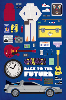
I like the idea of combining lots of images that have something in common, on one whole print. Lovely idea, each relating to objects/iconic images from specific films. 
 ---------------------------------------------------
b&w still

Saturday, October 29

Inspiration for...

White typeface, clear sticker

Interesting type layout

Like the use of the white box over an image/larger type. I also like the minimalist/small column of text

Nice image, lines and textured 

Lovely bars of chocolate, with a patterned design. I bought a bar of Galaxy chocolate and noticed how it related to reading, I thought I could produce the packaging for a bar of chocolate that could be sold with the books. 


Lovely packaging and branding for a fishmonger. Love the use of tracing paper with an image to wrap the fish. I thought about wrapping each individual book in a patterned tracing paper. 

Friday, October 28

inspiration for...

Like how these work as a set, and how they have been laid out as a grid
use of block colour and lines separating information
I thought this could be useful for my prints that are going to be folded within the book package. I thought about spelling 'Read' using the patterns from the different book covers.
Range research. Like the use of black and white photography
Research into ticket/fold out pieces.
Clever concepts (I want to apply concepts like this to my illustrative magazine covers for 'g2'
Collection of illustrations all relating. I had an idea for one of my magazine covers, being a collection of illustrations to do with either Halloween, or Christmas.


(Image above) More lovely concepts behind a simple drawing/image, much like what I want to achieve with my magazine covers. 


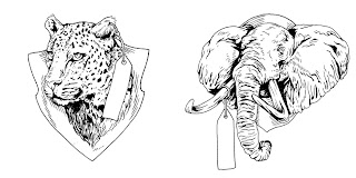
Black and White illustrations


Lovely illustrations, considering layout and use of page space and blank space
Black and White image and type/photograph & type.
Another illustration with a nice idea

Book cover fold out consideration, lovely pattern