Like how these work as a set, and how they have been laid out as a grid
use of block colour and lines separating information
I thought this could be useful for my prints that are going to be folded within the book package. I thought about spelling 'Read' using the patterns from the different book covers.
Range research. Like the use of black and white photography
Research into ticket/fold out pieces.
Clever concepts (I want to apply concepts like this to my illustrative magazine covers for 'g2'
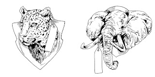
Collection of illustrations all relating. I had an idea for one of my magazine covers, being a collection of illustrations to do with either Halloween, or Christmas.
(Image above) More lovely concepts behind a simple drawing/image, much like what I want to achieve with my magazine covers.
Black and White illustrations
Lovely illustrations, considering layout and use of page space and blank space
Black and White image and type/photograph & type.
Another illustration with a nice idea
Book cover fold out consideration, lovely pattern


No comments:
Post a Comment