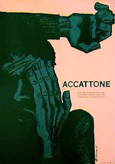
Considering different ways of approaching film posters, layouts, image and text hierarchy, colour etc...
- image manipulation
- interactive feel to the image
- structure of image
-angles, layout
- interesting colour
- image style
- layout of type and image
- obviously separated
- blank space
- image creeping into the page
- text working WITH image
- structural approach
- clean/crisp
- lines
- image off center
- simple, blocked image
- painted image


No comments:
Post a Comment