Monday, May 10

ADVERTISEMENTS


I really like these adverts for Film4, the split screen looks professional and draws the viewers
attention to all over the screen. Even though the footage itself is not very fast, the
cinematography and division of it all expresses it in a very interesting and creative.
The simplicity of the screen shots/interviewing is just entertaining, obviously the main attraction
is who is actually being interviewed. With such big, Hollywood names a plain white background
behind a 'grayscale' face actually works very well. It forces the viewers to focus on what should
focused on, what is being said.

speaking from experience, context!

Thought about my project when I saw this, could it be want and need? As in shopping trolleys, relating to the food 'want and needs'. popcorn & grapes?
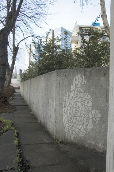
This designer primarily focuses on typography, shaping the type to fit in with the specific object. I think the banana one became the strongest interest for this project. Not sure whether this style has been done quite a lot before, it isn't my favourite.

Method of delivery? relevant or not?


SIMPLE AND EFFECTIVE. The design I am thinking of taking forward contains two words, 'want' and 'need', in large font and legible type, alongside two images to represent the point. This deals with large font and nothing else yet even though there isn't much to look at in terms of context on the piece of work, it still puts the point across.

Friday, May 7

speaking from experience, context!

I think I need to find more inspiration for the design of my posters and style following through the range of products for this brief. The original idea I had stemmed from the posters I found at first, 'want and need', I may have made the mistake of withdrawing too much of their style into my own. I need a new style and a new font, through many different graphic design pieces, how can I take this further?
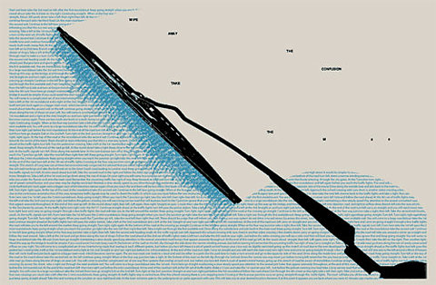
I like the use of the type in this, clever use of very small type that actually comes across as something.
Simple when it comes to the colours, I want my design to be vibrant and attractive but keep the colour palette quite limited.
layout- This almost looks like a piece of graphic design
Doesn't relate to much to my project, but in terms of design context, I like this.
Same designer as the previous poster, I like the bands, lines, circles, overall order and directness?
POSTER INSPIRATION

Simple drawings with just block colour, this relates to the style I use for the drawings for my designs.

http://www.toothpaste-frosting.com/#384729/In-A-Perfect-World
On this website, there is also a selection of designs that relate a lot to the 'want' and 'need' ones I originally found. They are under the caption, 'In a Perfect World'. I think it's the simplicity of them and the topic of perfection as appose to reality relates a little bit to how sometimes you don't always get what you want.

Tuesday, April 27

mag layout s

simplicity of this one, use of two colours
use of larger type (numbers)

love this use of layout, not sure why, the strip is nice
prefer the left page really, like the direct split of blackandwhite

decided, I don't like majority of large photos on one page, but I like the use of the circles in this

release of birds across both pages, I like how a double-page spread can link

the use of one large photo works well, as long as the text incorporates nicely

Friday, April 16